via theatlantic.com
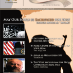
The whole thing reads like something straight out The Onion. Come to think of it, the magazine cover also looks like something out of The Onion.
As an aside, I still have the style manuals for some Gulf countries (some of the countries in the Arab Gulf use branding and marketing concepts to “design” their image, logos, symbolism, etc. I even know a few people that were hired to “design” countries’ “images”). And this cover hits the trifecta of “Gulf” style: sandy colors, gold logo in the upper left, insipid photography. Well done marketing guys, obviously you are pros with a penchant for regional stereotypes!
For the past decade and a half I have been making all my content available for free (and never behind a paywall) as an ongoing practice of ephemeral publishing. This site is no exception. If you wish to help offset my labor costs, you can donate on Paypal or you can subscribe to Patreon where I will not be putting my posts behind a lock but you'd be helping me continue making this work available for everyone. Thank you. Follow me on Twitter for new post updates.


